
Scrivener user interface: The editor’s workspace
Scrivener is for writers and editors
The majority of a writer’s time is spent editing, and Scrivener provides an editor’s workspace that is customisable in almost every respect.
The editor’s workspace
When I’m editing, I tend to have the Inspector open so I can see comments I’ve left for myself which need addressing during the editing stage.
I’ve already taken a look at the differences in the Inspector pane, between Scrivener 2 and Scrivener 3, in this post. Today, I’m focusing on how you might customise the workspace.
Suppose this is my starting point, in Scrivener 3.
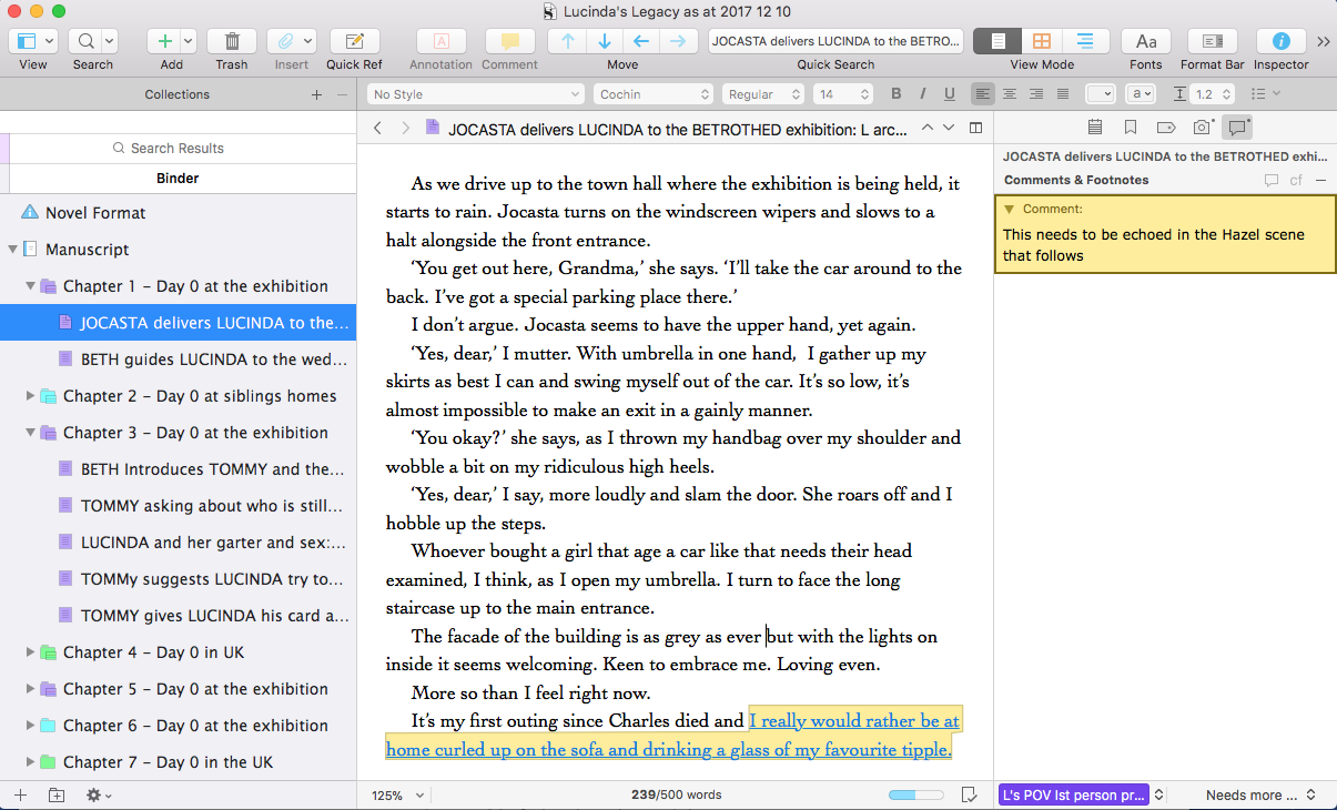
To process the comment, I’d need sight of the next scene with Hazel. I’d use split screens. This works in the same way as in Scrivener 2, and this post explains how to achieve split screens and also how to lock the Inspector to one Editing screen.
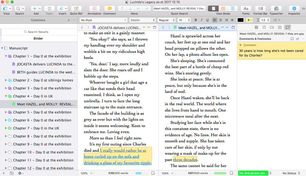
Now, having set up my panes for editing … I can also customise the workspace.
Customising the editor’s workspace
The change between customising the workspace in Scrivener 2 and Scrivener 3 is mostly cosmetic – and a bit of a turnaround!
The route to customising is the same: Scrivener / Preferences
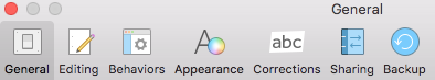
In Scrivener 2, there are then ten tabs.
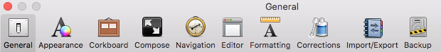
For Scrivener 3, there are only seven tabs.
Clearly, there has been some tidying up and repositioning of options! Today, I’m looking at customising the appearance of the editor’s workspace …
Controlling the Appearance of your editor’s workspace
Here’s what you see if you select the Appearance tab for Scrivener 2.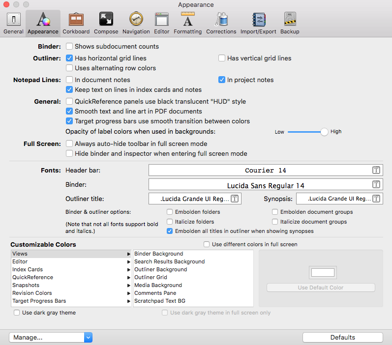
A lot to take in?
And here is the new Scrivener 3 Appearance pane. Notice the list in the left-hand pane: General interface, Binder, etc. Each of these has its own right-hand pane.
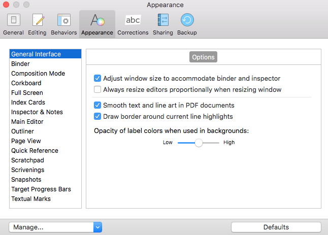
And all you see is what is relevant, having made a choice in the left-hand pane … for the General Interface, it’s a single set of options.
For the Binder option, for example, there are three tabs: Options, Fonts, and Colors.
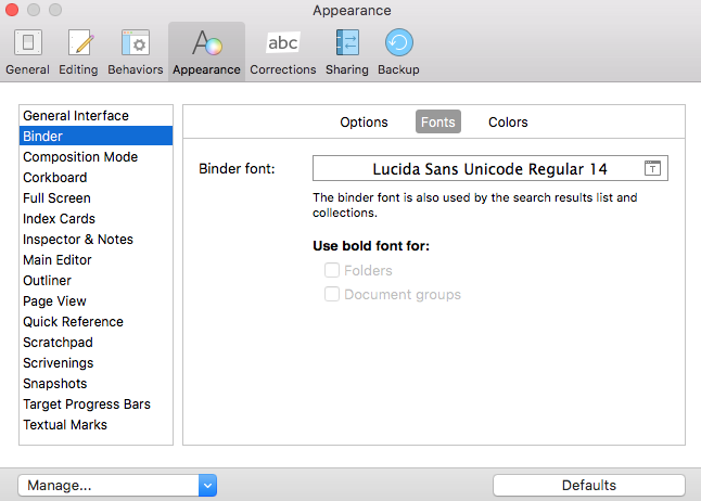
And the Fonts tab is where I can control the font … for example, making it larger (for sharing during a Simply Scrivener Special) and smaller (for when I’m editing the text myself).
This revised user interface reduces overwhelm. No longer are you faced, immediately, with the enormous number of choices at your disposal; instead, you are presented only with choices relevant to previous decisions. That’s a huge improvement in the user interface?
Finding options that have moved … within the editor’s workspace
If you have been using Scrivener 2 for some time and know where everything is in the Preferences, having to track down an option in Scrivener 3 which has been moved in this redesign, might be very frustrating.
So, a walk-on-the-wildside exploring each of the groups is worth the investment in time. There are 14 more to explore (Composition Mode through to Textual Marks) and you could explore one a day … within a fortnight, you’d be clued up!
Questions about Scrivener? Need a helping hand? Want a demo?
To watch me go through the process of customising the editor’s workspace, or to ask any questions, book a Simply Scrivener Special.
To help me to prepare, you could also complete this short questionnaire.
The ScrivenerVirgin blog is a journey of discovery:
a step-by-step exploration of how Scrivener can change how a writer writes.
To subscribe to this blog, click here.
Also … check out the Scrivener Tips
on my ScrivenerVirgin Facebook page.
Geri Manchester
13 August 2018 at 23:35Can you tell me how to find one or two words within 10 chapters? Thx. Geri
Anne Rainbow
14 August 2018 at 10:54Use the Search feature, using the words that you’re looking for.
If you want to confine your search to 10 chapters (not the entire project), you might think about creating a collection of these 10 chapters first, and then searching within that collection. Doesn’t work! You are still left with the option either to search on document or to search on project.
So, I’d search on whole project, create a collection, and then just ignore the ones that are not in your 10 chapters.
For more details on Search, see this series of blogs: https://www.scrivenervirgin.com/2017/08/search-options-scrivener/
Hope this helps. (If you need more help sign up for a Simply Scrivener Special. They start again on 4 September.)