

Scrivener with Style: Introduction
Seeing the wood for the trees
Literature & Latte released Scrivener 3 for the Mac over a year ago and, with it, Styles. Pretty soon PC users, with Windows, will be enjoying this version of Scrivener.
To date, I’ve managed without using styles but I think it’s about time I (and you) became acquainted with this new feature. So, this first series of blog posts for 2019 is all about Scrivener Styles. (The second series focuses on the Scrivener 3 way to Compile.)
At first glance, using styles may look incredibly complicated, but I’ll break down the process so you can use what you need, and know what else is available should your needs change.
What is style?
The word style can mean many things. Here are just two takes on the word ‘style’.
- The way a writer puts things into words
The writing may be eloquent, or erudite, or use a lot of flowery words – and indicate the writer’s ‘voice’. Style includes the vocabulary the writer uses, how sentences are structured, the tone, etc. - The way something is done – or has become popular
This interpretation of the word style relates mostly to fashion, or custom, or short-lived fads, but can also apply to published material. Take a look at a newspaper from way back and a current one. They will look very different – the style has changed.
Here, within Scrivener, ‘style’ is used to describe how your writing looks, and how it – the headings, words, paragraphs and other features – is presented. Your ‘style’ is created using formatting … but formatting can be done with or without Scrivener Styles.
Why is a ‘style’ necessary?
Adopting a style means deciding how best to present your material so that it’s attractive to the reader, and the information is more easily absorbed.
Rather than just formatting line by line, using styles provides a consistent method of processing the appearance of your text, one that allows you to change your mind about the end look, and to experiment with it until you are happy with the final result.
It may seem like extra work, but it’s worth the investment in time. Trust me!
Scrivener’s default formatting style: No Style
When you first open a new project for a new novel, using the novel format, Literature & Latte present the guide to the Novel Format.
This single document demonstrates several formatting styles – but using the Scrivener default formatting style ‘No Style’.
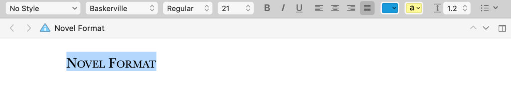
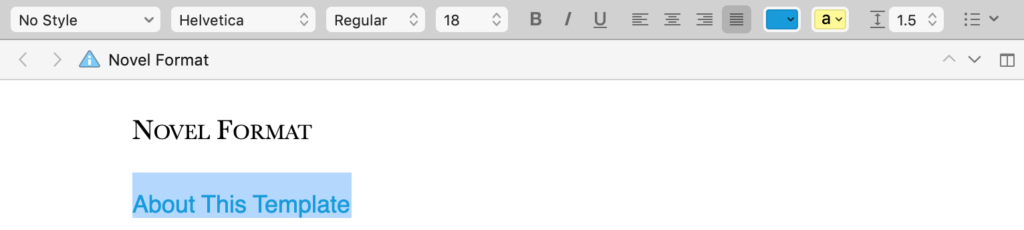
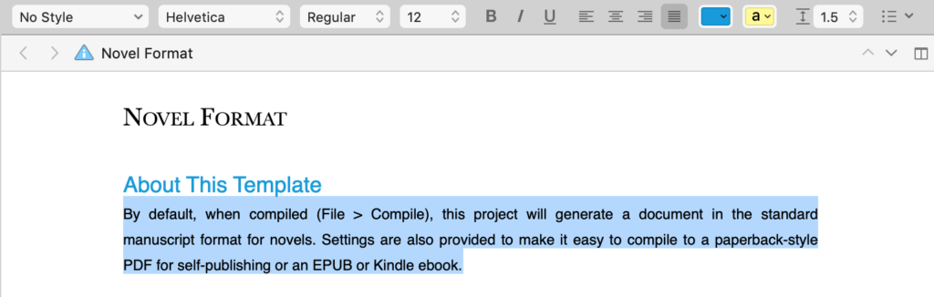
First, there is a heading: ‘NOVEL FORMAT’. All caps, Baskerville font and point size of 21.
The heading is also in black, but you might take that for granted until you notice the next level of heading is in blue. It’s in a different font (Helvetica) and a smaller point size (18). These are shown in the formatting bar above the text.
Then … then, there’s a paragraph of text – also Helvetica, back to black and a much reduced point size of 12.
Including headings in any piece of writing – even this blog post – helps the reader to see at a glance what it’s all about. You can have several levels of headings and it makes sense to reduce the point size each time, with the smallest point size being used (usually) for the text of the piece.
I say usually the smallest, as you might use an even smaller one if you need to include captions for photos, diagrams or tables, or maybe some wise saw to open each chapter. (More on that in a later post.)
Each of these is a style:
- Heading 1: all caps, black, Baskerville 21
- Heading 2: blue, Helvetica 18
- Text: Helvetica 12
However, in the document, there is No Style so these individual formats were applied paragraph by paragraph.
Why were there no Scrivener Styles in this guide?
Good question! Except, it gets across the message; it’s a small amount of information; the formatting works.
But, if you were to see a copy of the Scrivener Manual, a much longer document, my bet is that named styles were used there, to good effect. And that’s what we’ll be learning about.
First, though, we need to know what’s available, what choices we need to make, in determining our style.
What are the formatting style options?
For the individual characters that make up words, there are four main formatting style choices to make.
- The font
- The point size
- The colour of text
- Any special effect (bold, italic, underline, strike-through)
There is also one ‘clever’ one which I’ll include here and then you need not to worry about it again. Kerning is the spacing between adjacent letters. The default option is usually the best; as with many default settings in Scrivener, you can leave well alone.
For paragraphs of text, there are more choices to make. It’s mostly concerned with the leading, or spacing between lines.
- What spacing will you have between individual lines?
- What spacing do you need between consecutive paragraphs?
Once you include a heading style, there’s even more to decide.
- What spacing do you want between a heading and a paragraph that follows it?
- What spacing will look best between the final paragraph and any heading that follows it?
Add to this mix: indentation.
- Blocked style uses no indentation for the first line of any paragraph. Instead, the leading (line spacing) between paragraphs makes it clear when one ends and the next starts.
- First-line indented style is as it suggests. The first line is indented but all subsequent lines are ‘full out’. There is no need for extra leading between paragraphs because the separation is clear.
And then there’s justification.
Left?

Or fully justified?
There’s no ‘right’ or ‘wrong’ in how paragraphs look; it’s a style decision. The aim is for consistency. However …
Using more than one formatting style in a document?
There are ‘rules’ about how many styles a reader will find acceptable. For example, how many fonts?
- Too many fonts and the text looks a mess – the reader can’t see the wood for the trees.
- Just one and it may look dull?
Three formatting mistakes to avoid
If you learnt to type an age ago, in the days of manual typewriters, you most likely try to control how the words appear on the page by using additional spaces at the start of a paragraph, or a tab jump, or additional space lines between paragraphs.
Your text might look like this.
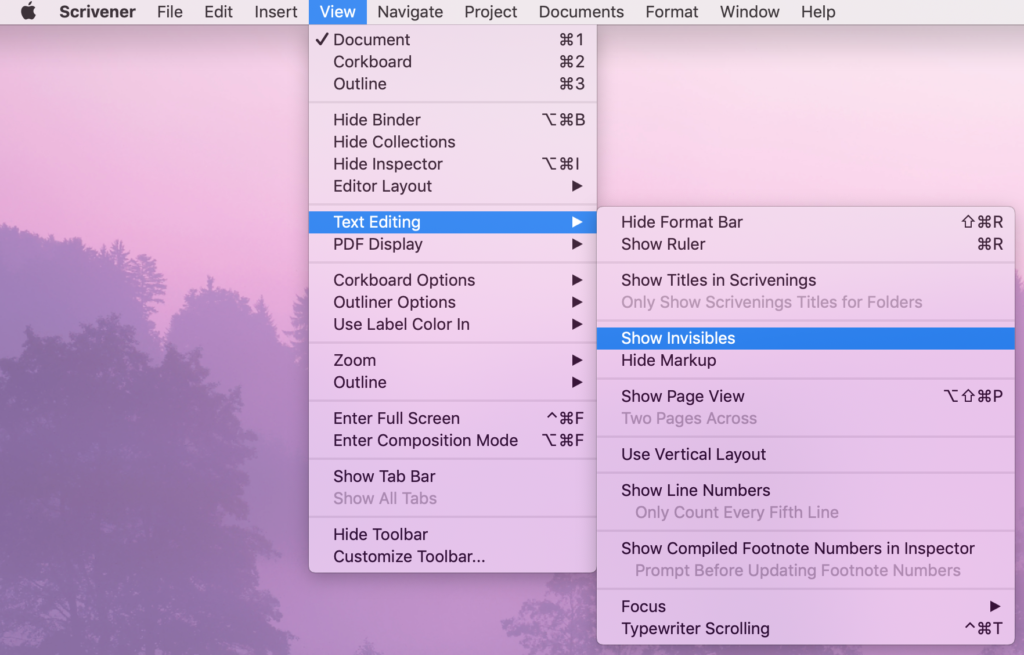
If you’re guilty of this practice, select Show Invisibles so you can see these rogue spaces, tabs, and returns.
Scrivener then provides some features which will cut down the chore of taking these spaces, tabs and returns out.
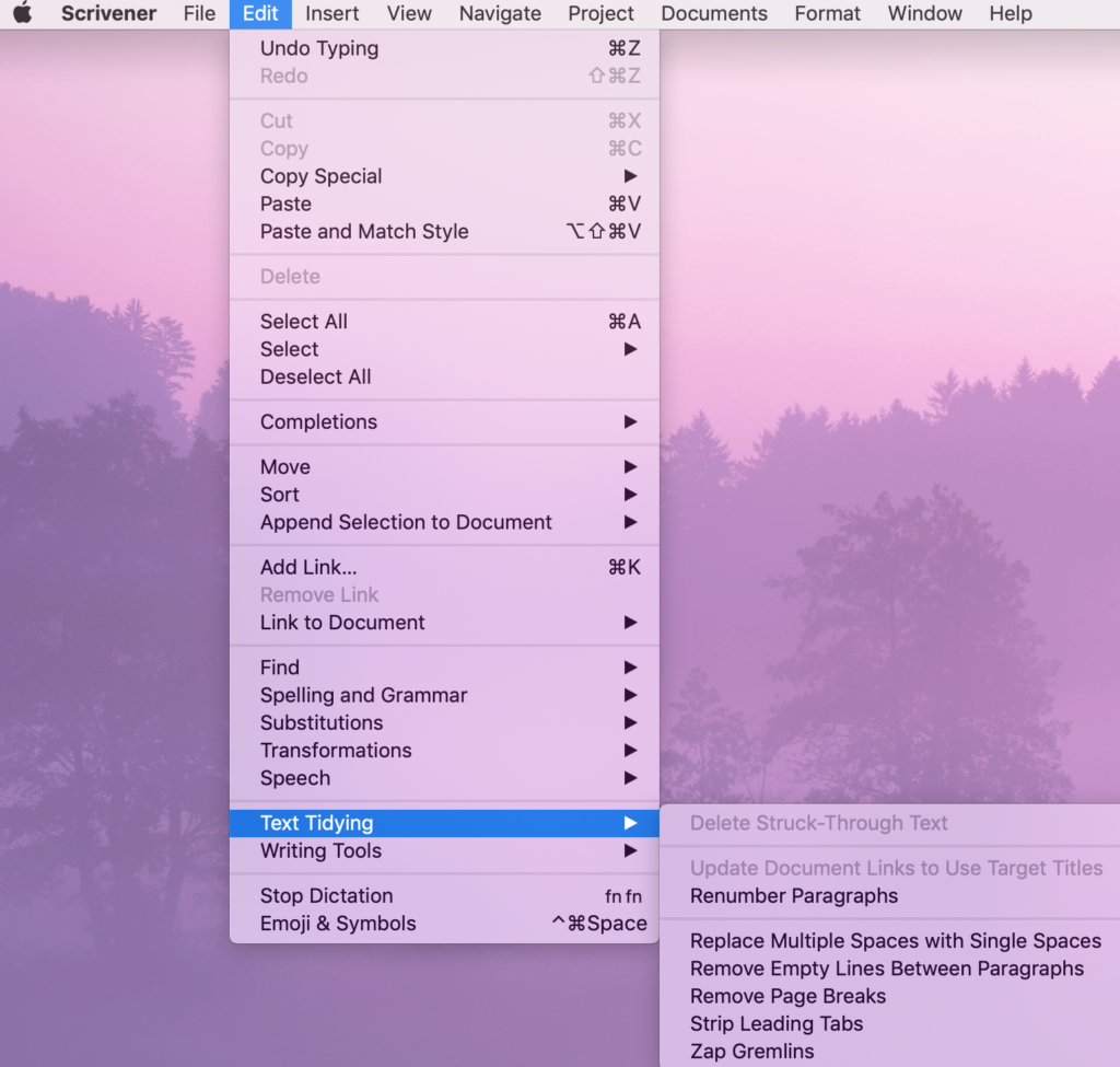
Use the bottom five Text Tidying Tools, and your manuscript will be ready for formatting, Scrivener style.
What will we discover in this series of blog posts?
Over the next few weeks, I’ll walk through all the formatting options, show you how to avoid formatting pitfalls and get you to the point where you can format what you see on the screen with confidence.
We’ll start with using ‘No Style’ and then work our way through various special styles that you might find useful.
After that, we’ll focus on how to use compile to output your manuscript to whichever form suits you: PDF, ebook, paperback, etc.
Questions about Scrivener? Need a helping hand? Want a demo?
To watch me go through the process of setting up a preferred font for a new novel or to ask any questions, book a Simply Scrivener Special.
To help me to prepare, you could also complete this short questionnaire.
The Scrivener Virgin blog is a journey of discovery:
a step-by-step exploration of how Scrivener can change how a writer writes.
To subscribe to this blog, click here.
Also … check out the Scrivener Tips
on my ScrivenerVirgin Facebook page.
Patricia Farrell
19 February 2019 at 00:17I need to know how to place running heads in my manuscript and I don’t see it anywhere, not even in the Scrivener 3 for Mac manual. I’ve searched everywhere and still no luck
Anne Rainbow
20 February 2019 at 11:45Hi Patricia. Running heads don’t feature while you are writing/editing. They are ot part of the onscreen layout. You set them up within File / Compile. Then they appear on your outputted version of your manuscript.
I’ll add your query to the Simply Scrivener Special list for next Tuesday. Register here https://register.gotowebinar.com/rt/3003454938809933315. If you register, you then get an email with a link to the recording – or come along and ask additional questions.
robert papa
21 January 2019 at 04:43great writing skills