

Scrivener with Style: The essential styles
Which styles are essential?
Which styles you will need – your set of essential styles – depends on what you are writing: fiction or non-fiction, a script, and so on.
Essential styles
For any document, there are various types of material:
- Headings
- Text
- Special features
The special features might be for tables (the title, column headings and entries), figures (captions), extracts (quotations) and so on.
A designer (you, if you are self-publishing!) never knows, until all the text is written and the full extent of the material is clear, exactly what will or will not work. So much depends on the extent eg how many characters you have in your headings.
Essential styles for a novel
Although a novel looks simple enough to style, it too can require a variety of formats.
Text styles for a novel
For a novel, a minimal set of styles for the text should work for you – and these are the ones I referred to previously.
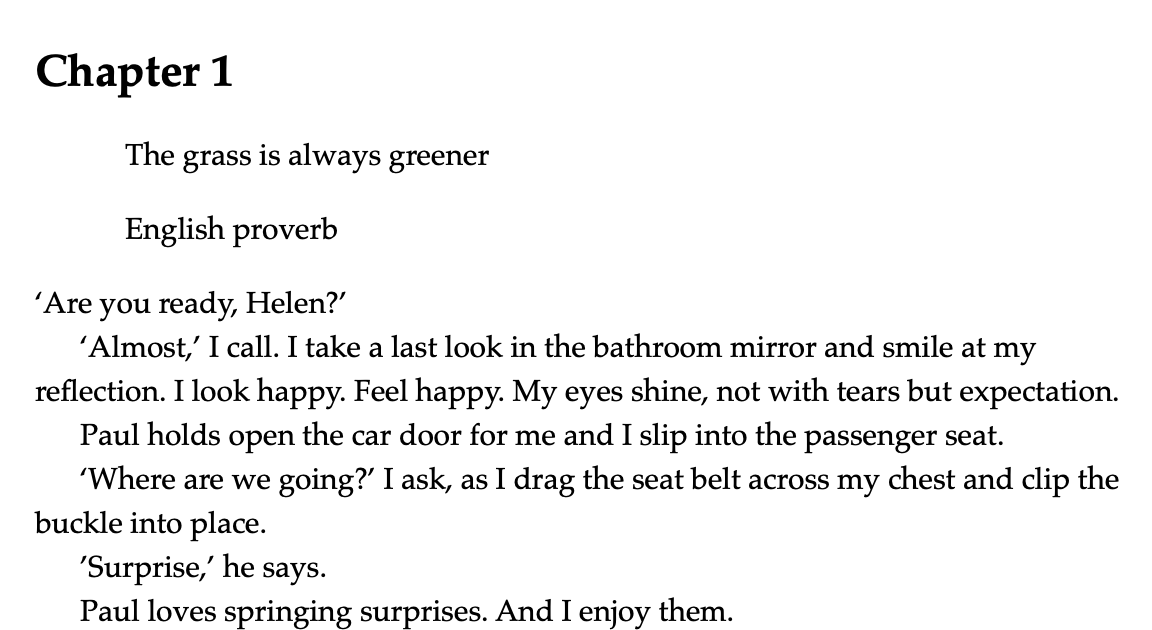
- Para fully blocked – for the first paragraph in each chapter
- Para indented the first line – for all other paragraphs
 Special styles for a novel
If you plan to include a quotation at the head of each chapter, Scrivener’s ‘blockquote’ and ‘attribution’ might look useful. On inspection though, these are pretty tame.
To personalise these to your own taste, you have two options:
- Create a new named style as per the previous post.
- Amend the Scrivener style to suit you.
Amending Scrivener’s default style would affect every project – so don’t go this route unless that’s what you want! Instead, start with the style which is closest to what you’d like. Tweak the formatting, highlight the text and then set up a new named style.
Starting with the attribution, I applied the Scrivener style, and then italicised the text and applied the right justification.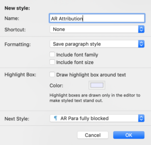
For the new named style AR Attribution, the Next Style is AR Para fully blocked.
Note that I needed to set up the AR Attribution style before the ‘AR ch opening quote’ – I’m working from the bottom up.
The AR Attribution style looks like this:
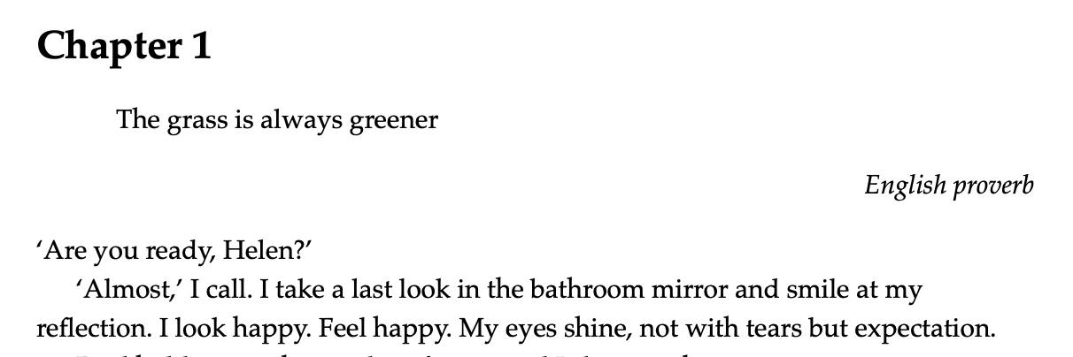
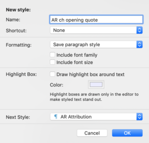
Now, if I tweak ‘The grass is always greener’ … I can set up the Next Style for that as AR Attribution.
Heading styles for a novel
Novels usually require only one heading style: that of the chapter.
It should come as no surprise that I’ve left the styling of the chapter heading until last. It appears first and, therefore, the style needs to be set up last.
Remember that if you change Scrivener’s default style for the heading, it will affect all projects. Also, that, at this stage – writing and editing – you are only aiming for an onscreen experience that suits you.
I’d be inclined to stick to Scrivener default Heading 1. It’s okay?
(But if you want something different, you now know how to set up your own.)
Essential styles for a non-fiction book
As well as the styles for text (Para fully blocked and Para indented the first line) and maybe some special effects, the main difference between a novel style and a non-fiction style is that the non-fiction style is likely to have multiple levels of headings.
These are set up in just the same way, but there are a few pointers that I’ll share.
Point sizes for headings
The heading styles are numbered 1, 2, 3 and so on. The smaller the number, the more important the heading, and for this a greater point size is usually used.
Suppose your text is in 10pt. To make the headings stand out from the text, and for their relative importance be clear, if you need four levels of heading, Heading 4 could be 12pt, Heading 3 could be 14pt, Heading 2 could be 16pt and Heading 1 would then be 18pt.
This is all very well, provided your heading text is never so long that the associated point size forces a heading on to two lines. That would look daft.
So, with the WYSIWYG onscreen layout, I would recommend you make do with whatever Scrivener provides as defaults. Once your text is written, you could review the headings and adjust (make them bigger/smaller) to suit.
Spacing before/after
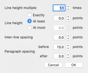 When formatting paragraphs (Format / Paragraph / Line and Paragraph spacing), there’s an option to control the spacing before and after.
The default for Heading 1 is to have 13.0pt above the heading and 0.0pt below.
The good general rule is to have 0.0pt after a heading – see how it looks, and increase this spacing if you wish.
With blocked paragraphs, you might choose to have 6pt after (equivalent to one line space); you don’t need this if you are using an indented-first-line style.
Designing a simple yet effective style for your book – including all your essential styles – requires a skill that most writers have to learn. Look at what others do; copy what you think looks good.
Questions? Need a helping hand? Want a demo?
To watch me demonstrating how to design and set up essential styles or to ask any questions, book a Simply Scrivener Special.
To help me to prepare, you could also complete this short questionnaire.
The ScrivenerVirgin blog is a journey of discovery:
a step-by-step exploration of how Scrivener can change how a writer writes.
To subscribe to this blog, click here.
Also … check out the Scrivener Tips
on my ScrivenerVirgin Facebook page.
No Comments