

Compiling with Scrivener 3: Style tweaking
If you’re not delighted with Scrivener’s default styles, you can always tweak them to suit yourself. Be aware that your new styles will apply to all your projects!
In this post, I share three easy style tweaking tips.
Style tweaking 1: Changing the font
If you want all the text to appear in one font, and you don’t like what you’re seeing, you can change it.
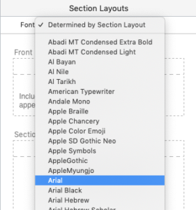
This simple tweak changes everything to that font. If you want to be a bit cleverer and have (say) one font for headings and a different one for the text, that will involve a bit of styling. We’ll look at that in a separate post …
Note though, some readers, like those reading your book using an iPad and the Kindle app, can choose their own font, overriding whatever you decided was best …
Style tweaking 2: Changing the padding
Padding is the term used for the white space at the top of a page, usually included for the start of each chapter. For more information on ‘white space’, click here.
This is how the start of a chapter might look, with padding. The chapter title ‘Introduction’ is positioned a few lines down the page.
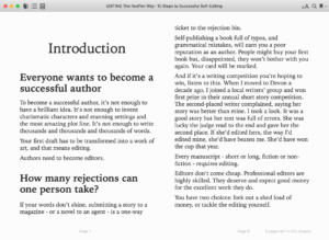
This is okay when you are outputting to a paperback, and most novels have maybe a third of a page of white space above the chapter title. For e-books though, I prefer to have no padding at all.
Tweaking the padding involves editing your settings for the section type assigned to the chapter heading.
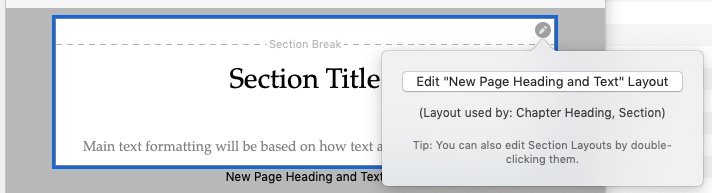
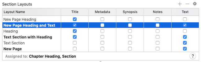
Click on the ‘Edit …’ button and you will then see the Formatting tab. The row highlighted is the Section Layout I’m using for my Chapter Heading section type.
Below that is another table of information, and there are a number of tabs. Choose ‘New Pages’ and you’ll see where you can control the padding.
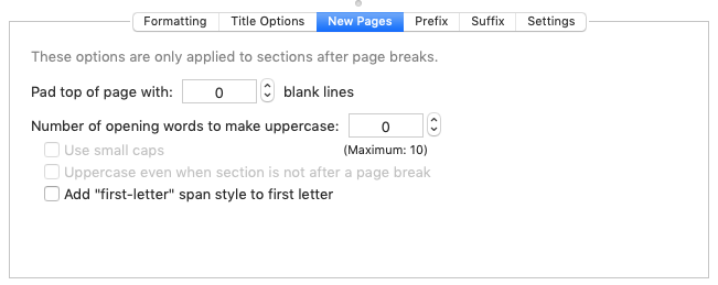
As I say, I prefer no padding, so I’ve set mine to zero.
Style tweaking 3: Separating your scenes with a row of asterisks
If, like me, you write your novels in scenes, you might want to make it clear to a reader where one scene ends and another starts. Maybe, there’s a jump in time, or action moves to a new location.
Scrivener offer the option to include separators (space lines or text, or whatever you want) between documents (ie, my scenes).
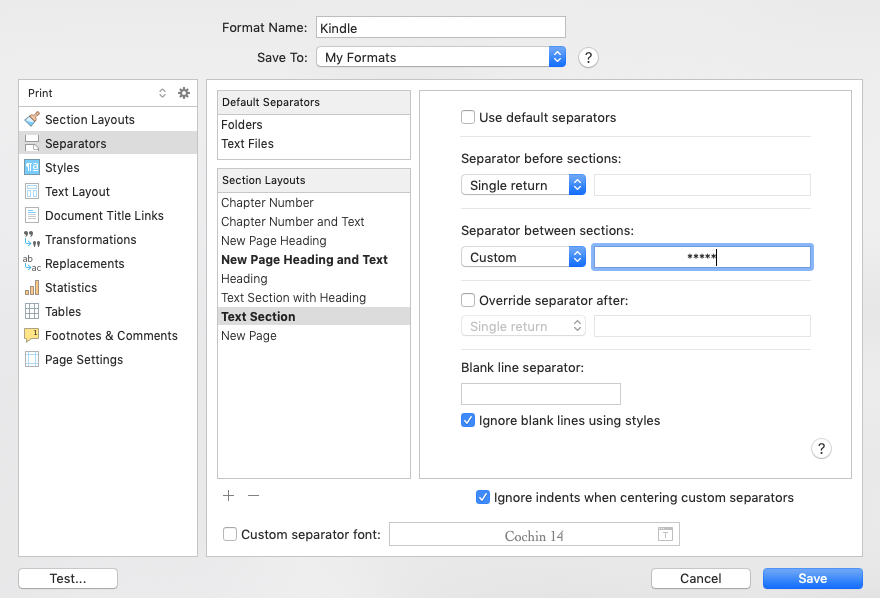
Select Compile, and get yourself to this screen with the Scene layout selected.
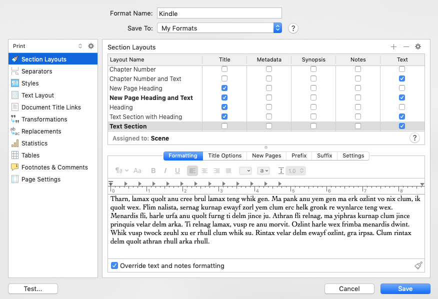
Then, on the left pane, select ‘Separators’. The correct Section Layout is highlighted (Text Section), which applies to your scenes. Decide what you want your reader to see and, choosing ‘Custom’ for the ‘Separator between sections:’ option, type in the text. I’ve put *****.
Easy!
Questions? Need a helping hand? Want a demo?
To watch me using Scrivener or to ask any questions, book a Simply Scrivener Special.
To help me to prepare, you could also complete this short questionnaire.
The ScrivenerVirgin blog is a journey of discovery:
a step-by-step exploration of how Scrivener can change how a writer writes.
To subscribe to this blog, click here.
Also … check out the Scrivener Tips
on my ScrivenerVirgin Facebook page.
No Comments