
DIY Book Formatting with Scrivener: Body Text 1
Pass me my glasses
Body text design starts the ball rolling for many other design decisions. It’s the majority of what your reader sees. In choosing the format for your body text, you need to consider these four settings.
- How big will the text be? This is called the point size.
- What font style do you plan to use? There are two main types: serif and sans serif. More on that later!
- How much space will you allow between consecutive lines of text? This is called leading (pronounced to rhyme with bedding rather than reading).
- What effect do you want on the right hand edge? Ragged? Or straight? This is called the justification.
In another post in this series, we’ll look at paragraph spacing, and indentation. Here though, we’ll have enough to discover, just in body text formatting.
Point size
Point size is one way of measuring the size of your text. There are 72 points to an inch.
Visit any library – or book store – and you’ll find a section called Large Print. Anything with a point size of 18pt or above is considered ‘large’. So your starting point for what to use is to choose something less than 18pt.
For a book, however, the ‘normal’ point size is 10-12pt. Harking back to the days when we used typewriters, 12pt was the standard, but it’s not the easiest to read. So, try something smaller. You can specify 10 or 10.5 or 11 or 11.5. (It’s always to the nearest half point.)
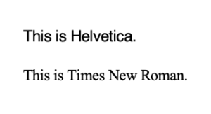
How it looks on the page is what’s important, and when you change font style, the text might look too big or too small depending on the combination of point size and font style. For example, these are both 10pt but Helvetica looks bigger than Times New Roman?
So, choose a point size (and don’t worry about it too much because you can always change it later). If you’d like to learn more about point size, read this article. And, if you’d like to learn more about your options, Wikipedia explains all the points sizes – they have names …
Font style
Font styles are categorised into two groups: serif and sans serif. Which you choose depends on the impression – or mood – you want to create in the mind of your reader.
- A serif is a decorative stroke which extends one or more of the lines used to form a letter. They are like feet or tails … and the theory is that material presented in a serif font is more formal, maybe more elegant. A serif font suggests tradition and history – and may be considered old-fashioned.
- A sans serif font has none of the ‘feet or tails’. It’s a cleaner style, simpler and maybe easier on the eye. And considered more modern!
And how do they look?
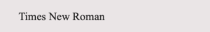
- Times New Roman is a serif font. See the ‘feet’ and ‘tails’?
- Helvetic is a sans serif font. No ‘feet’ or ‘tails’.

Scrivener font options
Scrivener offers a wide range of fonts. This screen grab comes from Compile.
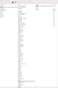
Notice that this window offers you a font family, a typeface (Regular, Italic, Bold or Bold Italic for the Times family of fonts) and a point size.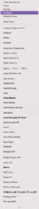
Not all font families offer all four typefaces, so if your material requires bold, and italic, check that your font choice allows for this. Others provide even more options!
If you’re not sure what each font style looks like, rather than try each in turn, check out the sample fonts available in the Editing pane.
![]()
The screen grab on the right shows only a fraction of the options.
- The arrow at the bottom allows you to scroll down to reveal the others.
- The ones listed at the top are the most used in my project.
- If you click on Show fonts, it takes you to the screen grab I took from Compile with everything listed but without the samples.
But, which font should you choose? Start by choosing between serif and san serif. This article gives more information about how you might decide (and it’s in a serif font). It’s funny though that the source (Google) presents the information in a san serif font.
Leading
The amount of white space between one line of text and the next is called leading. This harks back to the days when typesetters used pieces of lead (literally) to create space between one line of text and the next.
Leading is controlled through paragraph formatting. You can access this via Format / Paragraph / Line and Paragraph spacing.
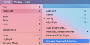
And this leads to a window where you can set the spacing you require.
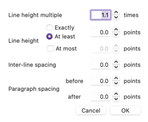
 Notice that this window also offers ‘Paragraph spacing’ – a topic I’m saving for the next blog post.
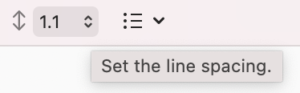
You can also control line spacing through the Formatting bar.
Be aware that your choice of point size (72pts per inch) plus any leading will determine the number of lines of text that can fit on a page. The larger the font/leading, the fewer the number of lines – the smaller the font/leading, the greater the number of lines. This also affects the number of pages in your book and ultimately the cost of producing the book.
Be aware also that, once you’ve also decided on the point size and spacing for any headings, you’ll want blocks of body text to ‘line up’ on facing pages. Choosing point sizes and spacing with unforgiving values (eg half points and/or odd numbers) can cause headaches. More on that in a later post!
Justification

Justification determines the positioning of a paragraph of text.
There are fours options.
- Left – which creates a straight edge on the left but ragged on the right.
- Centred – which is great for headers but not (usually) appropriate for body text.
- Right Aligned – which creates to opposite of ‘left’ ie a ragged left and a straight right edge. Not a good idea for body text, but could work if you have a single line of text which needs to stand out., eg a figure caption, a quote …
- Fully Justified – which create a straight edge on left and right. This is achieved by the software inserting additional spaces between words to stretch the line of text to fill the available space.
For body text, the choice is then between Left and Fully Justified. Pick up a book and you’ll find the industry standard is Fully Justified.
However, up until you are ready to publish, you might want to use Left as this shows more clearly any spacing errors in your work.
For example, depending on your era, you might still be putting two spaces after a full stop or other closing punctuation. This practice became obsolete when word processing software offered full justification. Why? The algorithm which works out where to add spaces to stretch the line of text uses the original spacing as a starting point. If you put two spaces after a full stop, the software might turn that into 4 or 5 spaces, which looks daft on the page.
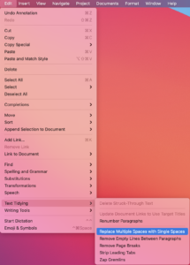
All is not lost if you are guilty of this double-space practice. Use Scrivener’s Text Tidying tool: Replace Multiple Spaces with Single Spaces. For more information on text tidying, read this blog post.
What next?
In this series of posts, we’ve now addressed the items in red. Next time, I’m focusing on the body text again – the four items in blue. After that, the remaining items still showing in black.
- The size of the page (width and height)
- The white space above the header
- The content of the header, its position (centred), font style and size
- The white space at the top of the page between the header and the story title
- The position (left aligned), font style and size of the story title
- The use of capitals in the story title
- The white space after the story title and before the text starts
- The paragraph style: indentation for the second paragraph, but none for the first
- The large W on the first line of the opening paragraph
- The use of capitals for the first five words in the opening paragraph
- The font style and size of the body text
- The line spacing of the body text
- The justification of the body text (fully justified)
- The widow at the bottom of the page (single line of text separated from the rest of that paragraph which falls on the next page)
- The white space between the final line of body text and the page number
- The position (centred), style and size of the page number
- The white space between the page number and the footer
- The content, position (centred), text style and size of the footer
- The white space below the footer
- The width of the left and right margins (they differ!)
Questions about Scrivener?
Need a helping hand with Scrivener tools? Want a demo? Book your own Simply Scrivener Special session with me, at a time to suit you.
And, if you need a steer on self-editing, check out my RedPen Editing course. Join RedPen Editing and enjoy a 5-day editing taster course for free.
The ScrivenerVirgin blog is a journey of discovery:
a step-by-step exploration of how Scrivener can change how a writer writes.
To subscribe to this blog, click here.
Also … check out the Scrivener Tips
on my ScrivenerVirgin Facebook page.
Pingback:Scrivener Advent Calendar: J is for ... - ScrivenerVirgin
10 December 2024 at 11:01