
DIY Book Formatting with Scrivener: Body Text 2
 This is the second of two posts focusing on body text in this series on DIY Book formatting. In the previous blogpost, I looked at the basics of body text: point size, font style, leading and justification.
In this follow-up post, I am considering four more aspects of body text formatting from our long list derived from studying a sample page of text.
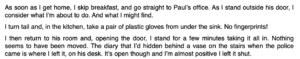
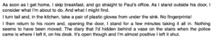
- The paragraph style: indentation for the second paragraph, but none for the first
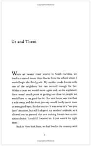
- The large W on the first line of the opening paragraph
- The use of capitals for the first five words in the opening paragraph
- The widow at the bottom of the page (single line of text separated from the rest of that paragraph which falls on the next page)
Paragraph break formatting
It’s important to format paragraphs so that the paragraph breaks are clear. There are two (style) options: blocked or indented-first-line. (I put ‘style’ in brackets as this is a style decision – there are no right/wrong answers – but there are conventions you might want to follow.)
Blocked
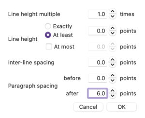
Blocked means there is no indentation to signify a new paragraph. Because there is no indentation, blocked paragraphing requires some leading (ie spacing) after the paragraph to distance it from the one that follows.
This is achieved through Format / Paragraph / Line and Paragraph Spacing.
I’ve used 6pt here as an example.
Personally, I rarely use a ‘blocked’ style but, if I did, I’d make the spacing 3pt so it’s visible but doesn’t take up too much space.
If you prefer the blocked style, then you can decide for yourself the spacing. Remember though, whatever you decide now, you can change it later. And, larger spacing will probably cost you extra pages and hence extra expense. But it can’t be so small that the paragraph break is unclear.
Indented first line
In this style, apart from the opening paragraph that follows a heading, all paragraphs are indented on the first line. 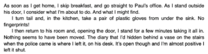
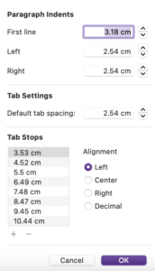 Never use tab jumps (or a series of six spaces like we did last century) to create the indent. It’s done through formatting. The existence of the indent and the amount of indent is controlled through Format / Paragraph / Tabs and Indents.
It’s up to you what size of indentation to use. Too big an indent can look silly. Too small can look like it’s a spacing error.
As with all other formatting decisions, the size of the indent can impact on the extent of your book. And you can easily change whatever you decide once you’ve seen how it looks on the page.
Using essential styles
I recommend the use of styles to format paragraphs. Essentially, you need to distinguish between opening paragraphs and the rest.
I’ve set up two styles: ‘AR Para fully blocked’ and ‘AR Para indented first line’. I could have called those style ‘AR opening para’ and ‘AR subsequent para’ but my preferred style is indented so I didn’t.
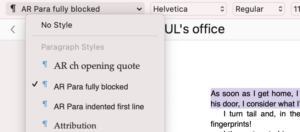
Note: I preface my style names with AR because those are my initials but also because it means they appear at the top of the styles list. I don’t have to hunt for them. If you preface yours, eg with AA, that will have the same effect.
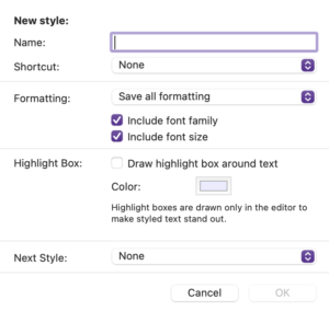
Note also that I created ‘AR Para indented first line’ first; and then, when I created ‘AR Para fully blocked’, I was able to specify that it was to be followed by the already created ‘AR Para indented first line’. See the ‘Next Style’ field at the end of the New style window.
Then, while typing in the Editing pane, I’d set the style for an opening paragraph as ‘AR Para fully blocked’ but, after that, whenever I hit the Return, the next style is automatically set for ‘AR Para indented first line’.
So, although my styles (ie the names of them) look like I’ve made up my mind already, I might want flexibility!
- For an ebook, I might want the blocked style.
- For a PDF, I might want indentation.
Such decisions happen at Compile time. Provided you have set up two styles as suggested, you can make up your mind when you Compile.
For me to achieve a ‘blocked’ style’, I just tweak my styles within Compile – making ‘AR Para indented first line’ have 0 indent, and giving both styles some leading after.
I explain more on this topic in this blog post. 
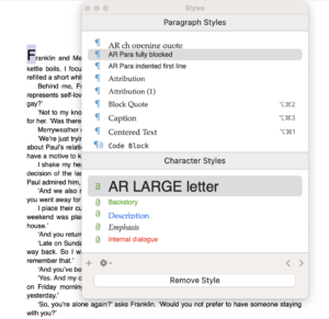
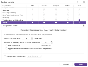
Character styles
To achieve the large character on the opening line, a new character style is needed.
This blogpost explains all!
Capitalisation
You might think we’re going to use styles again but, no. The opening line can be made all caps using a Compile setting.
This is the effect.
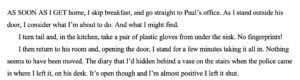
Although the example I chose applies both the large initial letter and the first few words in capitals, I wouldn’t advocate combining two such embellishments. One or the other is enough. Indeed, Literature & Latte agree with me and, with Scrivener, you cannot combine them …
Widows and orphans
Widows and orphans are lines which appear on one page while the rest of the paragraph is on a different page. Not good for the reader!
It’s easy to avoid. One tick on the Text Layout tab does it.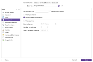
What next?
In this series of posts, we’ve now addressed the items in red.
- The size of the page (width and height)
- The white space above the header
- The content of the header, its position (centred), font style and size
- The white space at the top of the page between the header and the story title
- The position (left aligned), font style and size of the story title
- The use of capitals in the story title
- The white space after the story title and before the text starts
- The paragraph style: indentation for the second paragraph, but none for the first
- The large W on the first line of the opening paragraph
- The use of capitals for the first five words in the opening paragraph
- The font style and size of the body text
- The line spacing of the body text
- The justification of the body text (fully justified)
- The widow at the bottom of the page (single line of text separated from the rest of that paragraph which falls on the next page)
- The white space between the final line of body text and the page number
- The position (centred), style and size of the page number
- The white space between the page number and the footer
- The content, position (centred), text style and size of the footer
- The white space below the footer
- The width of the left and right margins (they differ!)
Next time, I’m focusing on the headings, headers and footers. It won’t be the end of this series as we still need to consider FrontMatter, EndMatter and how to tweak all the settings to arrive at a point where you are ready to publish.
Questions about Scrivener?
Need a helping hand with Scrivener tools? Want a demo? Book your own Simply Scrivener Special session with me, at a time to suit you.
And, if you need a steer on self-editing, check out my RedPen Editing course. Join RedPen Editing and enjoy a 5-day editing taster course for free.
The ScrivenerVirgin blog is a journey of discovery:
a step-by-step exploration of how Scrivener can change how a writer writes.
To subscribe to this blog, click here.
Also … check out the Scrivener Tips
on my ScrivenerVirgin Facebook page.
Pingback:Scrivener Advent Calendar: W is for ... - ScrivenerVirgin
23 December 2024 at 11:00