
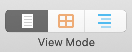
Editing pane options: Scrivenings
 Scrivenings = writing
It’s interesting that Literature & Latte chose this term; Scrivenings is a now obsolete English term for writing.
To me, it indicates a return to the old style of publishing: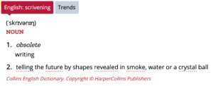
- Write the words and create galley proofs
- Proofread
- Incorporate figures and tables, and paginate
- Proofread the page layout (ie check the formatting)
- Publish
So, rather than focus on the product – the paged output – the writer focuses on the words, the content of what he/she is writing. Later (in Compile), the focus turns to the formatting, and the publishing options.
Anyway … a ‘scrivener’ is someone who writes and Literature & Latte, in their marketing, say that Scrivener is THE tool for any writer.
 I agree. And, in the final few posts of this series, I focus on how Scrivener can be used for a variety of writers and purposes:
- Planners and plotters
- Specific writing outcomes
- Fiction: novels and series
- Fiction: short stories, essays and poetry
- Memoir
- Non-fiction: how-to books, course materials, etc
- Social media posts and schedules
And scrivenings are what we write: the words that appear in the Editing pane.
Scrivenings as a View Mode
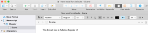
If you select one document in the Binder, the default is for Scrivener to display your text – your scrivenings – in the Editing pane.
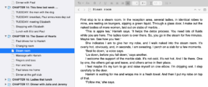
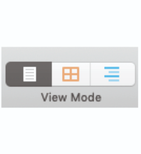
At the top right of your screen, you’ll see the View Mode icon, with the lefthand (Scrivenings) pane highlighted.
Notice that the image looks like a single sheet of A4 with some writing on it.
Customising the Editing pane
The text is presented as a continuous stream of text within the Editing pane. This is in line with how galley proofs looked, way back. If you’d rather see a paged effect, there is an option – Page View – which simulates the WYSIWYG (what you see is what you get) style you might be used to seeing on word processing applications like Word. This blog post explains Page View.
However, I would recommend you don’t get hung up on how your material looks ‘on the page’; instead, focus on the content. Get that right and leave worrying about how the end product will look after you’ve completed your first draft.
Back to the Editing pane!
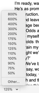 If the text is not large enough for you to see comfortably, there is a magnification option – bottom left of the Editing pane.
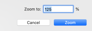
If the options don’t suit you, click on Other. This opens the Zoom pane, allowing you to specify the percentage magnification you require. (If you want all the screen enlarged, you’ll need to tweak the Apple Preferences.)
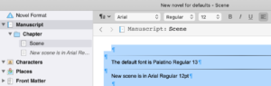
The default font is Palatino Regular 13. The text colour is black and the alignment is left.
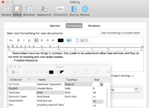
If you’d rather see a different font in your Editing pane, select Scrivener / Preferences / Editing and, in the Formatting tab, click on Aa to choose the font that suits you.
Any new documents that you create will have this font.
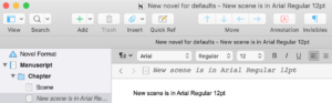
For any text you have already written, you will need to alter that through the formatting toolbar.
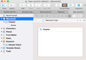
- Select the Manuscript folder in the Binder and Scrivenings as the Group Mode.
- Position your cursor within the Editing pane and use Ctrl-A to select all the text.
- Adjust the settings in the Formatting tool bar to suit yourself.
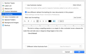
NB This change of font will also apply to all new projects! If you want to change the font but only for this project (ie not all future projects) use Project / Project Settings / Formatting instead. Tick the ‘Use different default settings for new …’ box and then choose the font using Aa.
Note also that the font (style and size) that you see on the Editing pane does not determine (necessarily) what appears when you compile. One of the strengths of Scrivener is that you can output a variety of formats – eg one for ebook, one for PDF, one for paperback – and choose different fonts for each. So – again – don’t get hung up on what you see in the Editing pane.
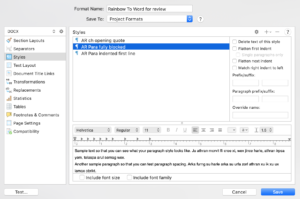
If you aiming for a professional finish, though, you will be aware that the opening paragraph of any chapter (or scene) is usually presented ‘full out’ rather than indented which is the Scrivener default. To achieve this, you will need to set up two named styles. I’ve called mine AR Para fully blocked and AR Para indented first line.
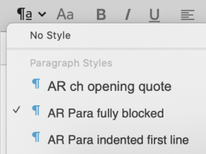
I use AR as a prefix on my named styles so I can see which styles are mine and which ones are the Scrivener default styles. This compiled result looks like this.
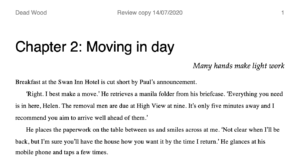
I’ve also set up a third named style: AR ch opening quote italicises and right-aligns the text ‘Many hands make light work’.
How to create named styles is explained in this blog post.
When you reach the stage of compiling, you can tweak the formatting for each of these named styles.
Scrivenings as a Group Mode
If your selection in the Binder is a chapter (a folder, or any other item which has subdocuments), the default is the Corkboard Group Mode (or Outliner if you had selected that previously).
To see your text in the Editing pane, click on the Scrivenings Group Mode icon. Notice (in the image above) that the Scrivenings icon now looks like two documents – both with writing. The text for all the documents selected is presented as a continuous stream of your scrivenings.
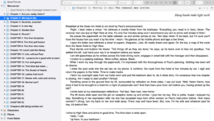
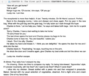
My chapter 2 comprises several scenes (documents) and the separation between these is identified by a faint line across the Editing pane.
Customising the separators in Scrivenings
If you’d prefer an alternative way of separating the scenes/documents, you have two choices.
- Using a different style of separator
- Displaying the Document titles with or without separators
For a different style of divider, select Scrivener / Preferences / Appearance and click on the Scrivenings tab. Select the Scrivenings Separator of your choice.
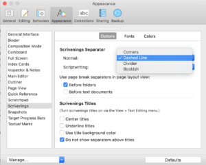
Notice that, towards the bottom of this pane there are boxes to tick or leave unticked regrading the use of Scrivenings titles.
With a dashed line as the separator, the manuscript looks like this.
If you would prefer to see the Scrivenings Titles, select View / Text Editing, and tick the Show Titles in Scrivenings option.
The format of these Scrivenings titles is controlled through Scrivener / Preferences / Appearance / Scrivenings, in the Fonts tab.
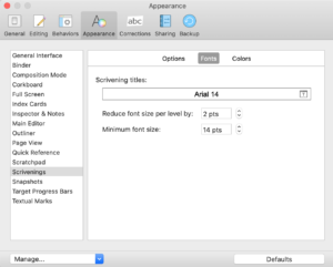
Notice that Scrivener offers a hierarchy of fonts to suit the number of levels of heading you have in your manuscript. For novels, we usually only have the chapter titles and scene titles. However, this option is useful for non-fiction books.
Further reading
The Editing pane can be split, so you can view two different documents (eg a scene and some research material) while you work. Or you can have Scrivenings in one half and choose a different View/Group Mode for the other. Click here for details of how to split the Editing pane.
Any questions about Scrivener tools?
To watch me using Scrivener or to ask any questions about Scrivener, book a Simply Scrivener Special.
To help me to prepare for the webinar, please also complete this short questionnaire.
The ScrivenerVirgin blog is a journey of discovery:
a step-by-step exploration of how Scrivener can change how a writer writes.
To subscribe to this blog, click here.
You can also find links to blogs of specific topics in the Scrivener index.
Also … check out the Scrivener Tips.
Pingback:Scrivener Advent Calendar: (XY)Z is for ... - ScrivenerVirgin
24 December 2024 at 11:01Pingback:Scrivener Advent Calendar: O is for ... - ScrivenerVirgin
15 December 2024 at 11:01Pingback:Scrivener Advent Calendar: G is for ... - ScrivenerVirgin
7 December 2024 at 11:02Pingback:Scrivener Advent Calendar: E is for ... - ScrivenerVirgin
5 December 2024 at 11:02Kenneth A. Wedin
18 June 2023 at 20:12I’ve been using Style Sheets since the beginning of my editing career in 1990 or 91, and I appreciate that you—like the other native English speaker in my Tokyo office—recognize that the first line should not be indented, except in the case of academic writing in accordance with MLA standards. I still haven’t found a way to use actual drop caps, other than manually formatting the first letter or first word in each section, which does not produce the same effect (i.e., having the artificial drop cap take up two lines). To compromise, I use small for the entire first word, which at least produces a similar feeling, despite differing from drop caps. I suppose it could be done in HTML5, which doesn’t help too much in Scrivener.
Anyway(s), what I wish to ask here is why you typically create your two different styles rather than click(ing) the ‘Flatten first indent’ box to the right for one single style to be applied to the whole page, while still leaving the first line of the first paragraph unindented. If I understand the intended purpose of that box correctly, it would have a function roughly similar to Microsoft Word’s pagination option of not placing a page number on the first page of a document but displaying the page number on all subsequent pages. Of course, this is for text and indentation of initial paragraphs in the body rather than pagination of documents with numbers in the footer, so the comparison might be unclear. Maybe you use two different customized styles because of how they export (compile) to different types of documents (e.g., Microsoft Word, ePub, web page, etc.)
Anne Rainbow
18 June 2023 at 20:59Good question (re styles)! If I were setting it up again (knowing that I was going to blog about it), I’d call my styles AR 1stPara and AR SubsequentPara. But as I tend to use full out for the first and indented for subsequent, I named them accordingly. As to why I don’t just tick that Flatten box … Once I get to compile, if I want, instead, to use a blocked style (no indentation for any para), it’s not just the indentation I need to tweak, I’d also need to adjust the leading so that the paragraph breaks are crystal clear to the reader. Hope this makes sense!